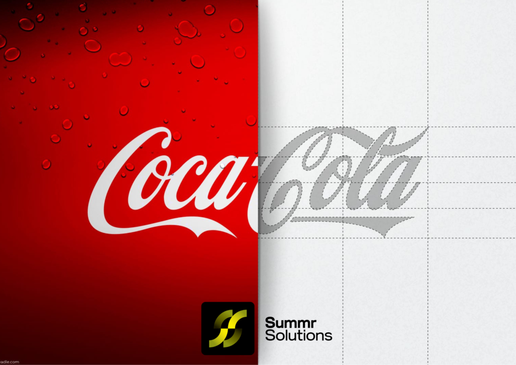
The Coca-Cola logo is one of the most recognizable and iconic symbols in the world. But like any great brand, Coca-Cola has gone through a series of logo redesigns since its inception in 1886. This blog will take you through the fascinating evolution of the Coca-Cola logo, the design choices that shaped its identity, and how the company has managed to stay fresh while maintaining its core branding for over a century.
1. The Birth of Coca-Cola (1886-1900)
When Coca-Cola was first invented by Dr. John Stith Pemberton in 1886, the logo looked very different from the one we recognize today. The first logo was a simple script created by Pemberton’s partner and bookkeeper, Frank Mason Robinson. He believed that the logo should have a distinct look and chose Spencerian script, a popular form of formal handwriting at the time.
The original logo featured:
- A flowing script style in black and white.
- No images, symbols, or icons—just pure typography.
This choice set the foundation for the brand’s iconic look.
2. Early Tweaks: 1900-1905
At the turn of the 20th century, Coca-Cola had gained significant popularity, and the logo began evolving to suit the changing trends. In 1900, the logo became more refined and elegant. Although still in Spencerian script, slight variations were made to enhance its visual appeal and distinguish the brand in the competitive market.
Key changes included:
- Sharpening the curves and adding more flourish to the letterforms.
- A slightly bolder appearance to make the logo stand out.
This period marked the first steps toward the more polished logo we know today.
3. A Splash of Color: The Emergence of the Red and White (1907-1931)
One of the most significant developments in Coca-Cola’s logo history was the introduction of the now-iconic red and white color scheme. The red hue was selected for its vibrancy, meant to catch attention, especially in outdoor advertising. By 1923, this color became an integral part of the brand identity, establishing Coca-Cola’s association with the energetic, youthful, and fun vibe it still projects.
By 1931, Coca-Cola’s logo had:
- Fully adopted the red and white combination.
- Remained mostly true to the Spencerian script, with minor refinements.
The uniformity in branding started to solidify with consistent use of colors in Coca-Cola’s packaging, advertisements, and marketing campaigns.
Are you ready to create an iconic logo that lasts? At Summr Solutions, we specialize in custom logo design that captures the essence of your brand. Let us help you develop a logo that’s not only memorable but speaks directly to your audience.
4. The Wave of Change: 1941-1960
World War II and the post-war years saw a shift in Coca-Cola’s marketing strategy. The brand now focused heavily on reinforcing its connection with American culture. This period saw minimal changes to the logo but added new elements to its presentation.
Notable developments during this era:
- The introduction of the Dynamic Ribbon or Contour Bottle motif around the logo, a visual element meant to mirror the design of the Coca-Cola bottle.
- Continued emphasis on red and white branding to ensure brand consistency.
The logo itself remained in Spencerian script, but with the addition of graphic elements around it, Coca-Cola began exploring ways to evolve while staying true to its roots.
5. The Simplification Era: 1960s-1980s
The 1960s marked a period of simplification for many brands, including Coca-Cola. Companies wanted their logos to be easier to reproduce across various mediums like TV, print, and billboards. As a result, Coca-Cola streamlined its logo design while still keeping the core elements intact.
Key features during this era:
- The Spencerian script remained, but the surrounding elements became more minimal.
- Introduction of the “Coca-Cola” sans-serif logo for select marketing purposes, which allowed the brand to experiment with modern aesthetics while keeping the original as the central logo.
- The Dynamic Ribbon continued to be used but in a more simplified, stylized form.
6. The 1980s: “Coke” Enters the Scene
In the 1980s, Coca-Cola made a bold move to officially introduce the nickname “Coke” as part of its logo and brand identity. The decision was based on the immense popularity of the shorthand name among consumers.
The logo changes:
- Introduction of the “Coke” logo, in which “Coke” was displayed in bold letters alongside the traditional Coca-Cola script.
- This allowed Coca-Cola to cater to a younger audience who gravitated toward the catchy nickname.
Although this move was met with some controversy among purists, it ultimately helped strengthen Coca-Cola’s brand among younger generations.
7. Modern Refinements: 1990s-Present
The last few decades have seen Coca-Cola make only subtle refinements to its logo. The core script design has remained largely unchanged, but the brand has experimented with new ways to present the logo through packaging and advertising. For instance, the Dynamic Ribbon, which has been a part of Coca-Cola’s identity for over half a century, was enhanced in 2007 with a more modern twist.
Recent logo trends:
- Coca-Cola often plays with visual effects, incorporating 3D, shadows, and other treatments to make the logo feel fresh while maintaining its historical roots.
- Minimalist approaches have occasionally been used in modern campaigns, such as limited editions with just the red color and no text—leveraging the brand’s iconic status.
Take the first step toward building a lasting brand identity today. Contact us to get started on a logo that represents your unique business.
8. Coca-Cola’s Global Appeal: A Universal Symbol
One of the most impressive aspects of Coca-Cola’s logo evolution is how it transcends cultures and languages. While the core logo has remained consistent, localized versions of the Coca-Cola script have been designed for various languages, such as Arabic, Chinese, and Cyrillic, ensuring that the brand is instantly recognizable worldwide.
Coca-Cola’s ability to adapt its logo while maintaining brand integrity has been key to its success on a global scale.
9. Coca-Cola’s Logo Today: Timeless and Iconic
As of today, Coca-Cola’s logo stands as a testament to the power of branding and consistency. While the logo has been refined and modernized over the years, it still holds true to its original concept: an elegant and flowing script with a timeless red and white color palette. This has made Coca-Cola an enduring symbol of refreshment, nostalgia, and fun for generations of consumers worldwide.
Conclusion: The Power of Consistency in Branding
The evolution of the Coca-Cola logo is a powerful example of how a brand can evolve while staying true to its core identity. While many companies undergo radical logo transformations over the years, Coca-Cola has proven that maintaining consistency, with slight refinements, can lead to a brand that stands the test of time.
For companies looking to evolve their own branding, Coca-Cola’s story offers a valuable lesson: focus on building a recognizable identity, be open to small, strategic changes, and always keep your core values front and center.
Ready to Create Your Own Iconic Logo?
Your brand deserves a logo that stands the test of time, just like Coca-Cola’s. With Summr Solutions’ custom logo design services, we’ll help you craft a logo that reflects your brand’s personality and vision.
Reach out to Summr Solutions today for a free consultation and start building the face of your brand!


