Dark mode has become one of the hottest trends in web design, but it’s more than just a passing fad. It offers functional benefits and can significantly impact the user experience. Whether you’re a brand considering this sleek, contemporary feature or a developer looking to enhance accessibility, dark mode presents multiple advantages. But is it the right fit for your website? Let’s explore the reasons why you might want to incorporate it into your design strategy.
1. Reduced Eye Strain for Users
One of the primary reasons for the rise of dark mode is its ability to reduce eye strain, especially for those browsing in low-light settings. Bright screens can cause discomfort, especially when used for extended periods. Dark mode, with its muted tones and lighter text on dark backgrounds, reduces this visual fatigue. For users who work at night or are frequently on their devices in dark environments, it provides a more comfortable viewing experience.
Studies have shown that high contrast between text and background can improve readability. However, bright screens in dimly lit environments can lead to discomfort and even headaches. Offering its option helps mitigate these issues, providing users with more control over their experience and potentially increasing the amount of time they spend on your site.
2. Improved Battery Life
For mobile users, dark mode isn’t just about aesthetics or comfort—it can also help conserve battery life. OLED and AMOLED screens, commonly found in smartphones, only light up the pixels that display color. In dark mode, fewer pixels are illuminated, resulting in reduced power consumption. This can significantly extend battery life for users who frequently browse on mobile devices, making your site more appealing to those who are always on the go.
Battery efficiency may not directly improve your website’s performance, but it can enhance the user experience. Users who can browse your site for longer without worrying about draining their battery are likely to stay engaged, particularly if you offer content-heavy or media-rich experiences.
3. Modern and Sleek Visual Aesthetic
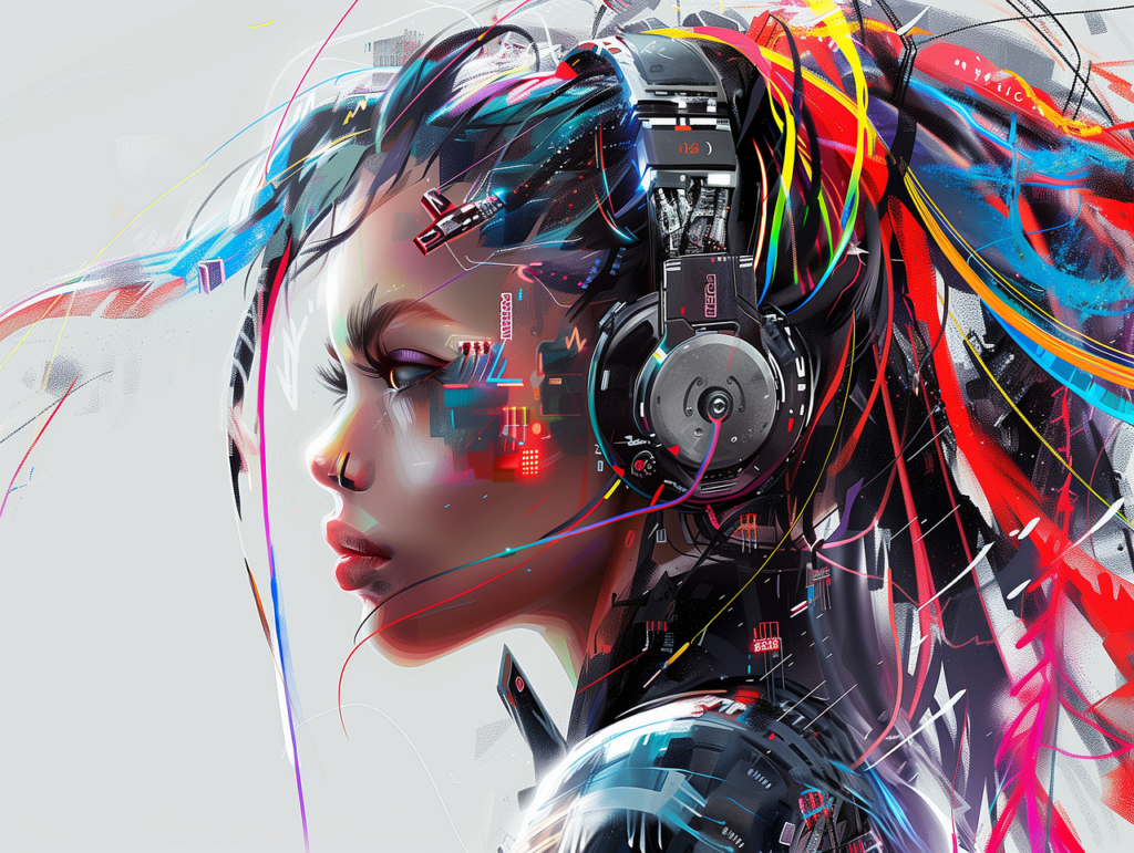
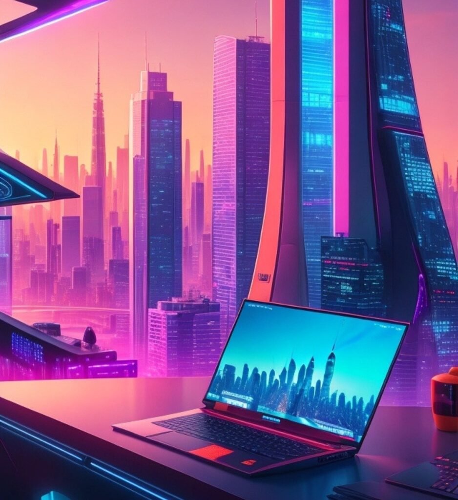
Dark mode also offers a sleek, modern look that resonates with today’s digital aesthetics. It gives websites a contemporary feel and can help certain visual elements—such as images, graphics like
bouba kiki effect, or vibrant colors—stand out more. ti tends to create a sense of luxury and sophistication, which can align perfectly with brands that aim to position themselves as innovative, tech-forward, or premium.
This visual style isn’t just a preference—it can make a website more memorable and distinct. For example,
DesignSphere have successfully used dark mode to create unique brand identities, making it a powerful tool in their design strategy. And brands in industries like technology, fashion, or media may benefit from a dark mode design to differentiate themselves from competitors. It’s a simple yet powerful way to create a unique brand identity that speaks to your target audience.
4. Accessibility and Inclusivity
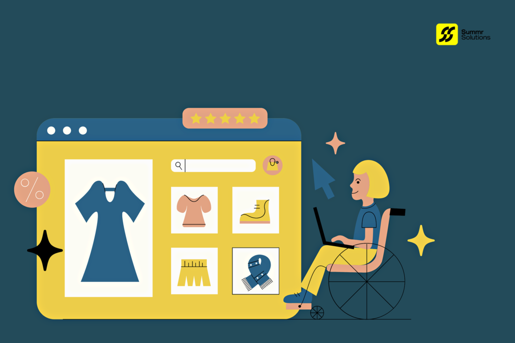
Accessibility is an increasingly important aspect of web design, and itcan play a role in making your website more inclusive. Users with certain visual impairments, such as light sensitivity, may find dark mode easier to navigate. The higher contrast between text and background can also make reading easier for users with vision-related challenges, improving their experience on your site.
However, it’s crucial to design dark mode with accessibility in mind. Simply reversing colors isn’t enough—contrast, font choice, and layout should be carefully considered to ensure readability. A well-executed dark mode option can expand your audience and make your site more user-friendly for everyone.
5. Brand Identity Considerations
While dark mode offers several advantages, it’s not the best choice for every brand. If your brand’s identity is tied to a sense of lightness, openness, or warmth, dark mode may not be the ideal fit. For example, companies in industries such as healthcare, education, or wellness might find that dark mode clashes with their overall brand messaging.
On the other hand, brands that emphasize innovation, creativity, or luxury could benefit from the sleek, sophisticated feel that dark mode provides. It’s essential to consider how this design choice aligns with your brand’s values and how it affects user perception.
6. The SEO Impact of Dark Mode
While itself doesn’t directly influence your SEO ranking, it can impact factors that contribute to it, like user experience and engagement. Websites that offer an enjoyable, comfortable browsing experience may see lower bounce rates and longer session durations, both of which are signals that search engines consider when ranking your site.
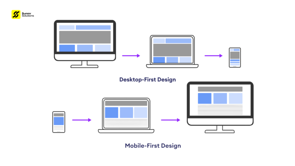
Additionally, with mobile browsing continuing to grow, offering features like dark mode that improve mobile user experience can help keep your site competitive in the mobile-first index. In this way, it could indirectly support your SEO efforts by making your site
more engaging and mobile-friendly.
Is Dark Mode Right for Your Website?
Implementing dark mode is not just a design choice—it’s a strategic decision that can improve user experience, accessibility, and even mobile performance. However, it’s essential to consider whether it aligns with your brand’s identity and your audience’s preferences.
At Summr Solutions, we specialize in creating custom web designs that not only look stunning but also prioritize user experience and accessibility. Whether you’re ready to implement it or need guidance on optimizing your site’s design for performance, we’re here to help.
Contact us today to learn how we can elevate your web presence and make your site stand out in both light and dark modes!


