In today’s fast-paced digital world, where first impressions matter, it’s essential to leverage every possible opportunity to make your brand stand out. One often overlooked but powerful branding tool is the favicon. This tiny, yet impactful element can significantly enhance your website’s professionalism and recognizability. But what exactly is a favicon, and how can you create an impactful one?
In this comprehensive guide, we’ll dive into the basics of favicons, their importance, and practical tips to design one that leaves a lasting impression.
What is a Favicon?
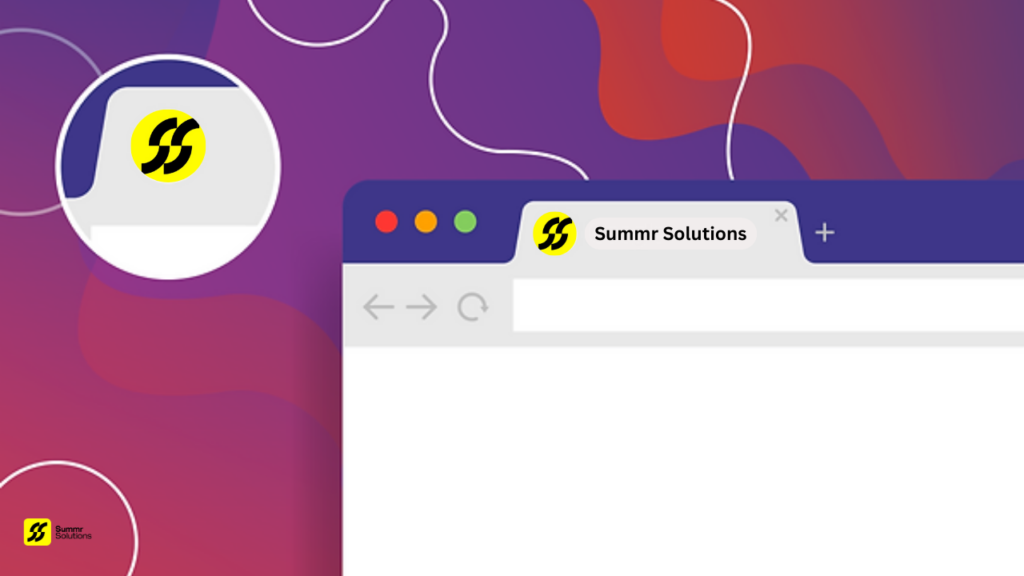
A favicon, short for favorite icon, is a small, square image that represents your website. It typically appears in a browser’s tab, bookmark list, and address bar next to the URL. Despite its diminutive size (usually 16×16 or 32×32 pixels), this image serves a crucial role in brand recognition and user experience.
Here’s why favicons are essential:
- Branding: A favicon is a visual representation of your brand. It’s often the first thing users notice when navigating between tabs, and a well-designed favicon can help your site stand out in a crowded digital landscape.
- User Experience: Favicons make it easier for users to recognize and return to your site. It adds a professional touch to your web presence and ensures consistency across multiple platforms.
- Credibility: Websites with favicons are perceived as more trustworthy. Without one, your site may look incomplete or less professional.
- Cross-Platform Recognition: Favicons can also appear on mobile devices as shortcuts or on browser bookmarks, extending your brand’s visibility beyond the desktop experience.
👉 Ready to create your favicons? Start by brainstorming ideas for your design!
The Importance of an Impactful Favicon
Favicons may seem insignificant because of their size, but their impact on user experience and brand recall is undeniable. Here’s why you shouldn’t underestimate the importance of a well-crafted favicons:
- Brand Consistency: Every touchpoint your audience has with your brand should reinforce your brand identity. A favicon, consistent with your brand’s logo, colors, and style, adds a layer of familiarity and professionalism to your website.
- User Navigation: When users have multiple tabs open, a favicon helps them quickly locate your site. This can improve overall site engagement and make it easier for users to switch between their tasks without losing track of your content.
- Bookmarks and Home Screens: Favicons aren’t just for browser tabs—they also appear when users bookmark your site or add it as a shortcut on their mobile devices. A distinctive favicon increases the chances of users revisiting your site from these platforms.
- Search Engine Listings: Some search engines, like Google, display favicons in search results, further enhancing your brand’s visibility. This can improve click-through rates, as users may be more inclined to click on a recognizable brand icon.
👉 Don’t have a favicons yet? Contact us to help you design a favicon that embodies your brand!
4 Tips for Creating an Impactful Favicon
1. Keep It Simple and Recognizable
When it comes to designing a favicons, simplicity is key. Given the size constraints (typically 16×16 pixels), it’s essential to focus on creating a clean, uncomplicated design that is easily recognizable. Complex designs with too much detail may look great on a larger scale but can become indistinct when scaled down.
Tips for Simplicity:
- Use Your Logo or Initials: Many brands simply use their logo or a simplified version of it for their favicon. If your logo is too complex, consider using just the initials or a symbol that represents your brand.
- Limit Colors: With such a small canvas, using too many colors can overwhelm the design. Stick to your brand’s primary color or a limited palette to ensure clarity.
- Test at Different Sizes: Always test your favicon at various sizes to ensure it’s clear and legible, even when scaled down to the smallest size.
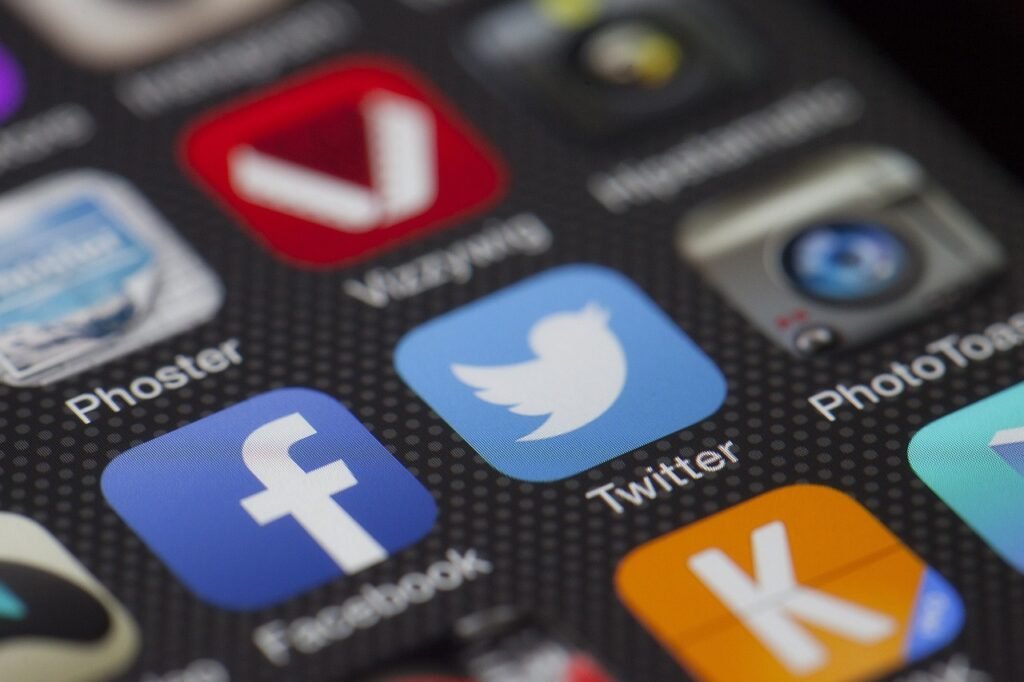
Example: Think of the iconic “G” of Google or the bird silhouette of Twitter. Both are extremely simple yet instantly recognizable.
👉 Looking for a professional touch? Explore our graphic design services to create a stunning favicon that reflects your brand’s essence!
2. Stay Consistent with Your Brand Identity
A favicon is part of your overall brand ecosystem, so it should align with your company’s identity. Consistency in design elements across your website, logo, and favicon ensures users make a direct connection between your favicons and your brand.
How to Achieve Consistency:
- Stick to Your Brand Colors: Use the same colors found in your logo and other marketing materials.
- Typography and Shapes: If your brand uses a specific font or distinctive shapes in its logo, try to carry these over into the favicon design. You can use stylized letters, monograms, or symbols to maintain the visual connection.
Example: Facebook uses a white “f” on a blue background, consistent with the company’s branding, making it immediately recognizable.
👉 Not sure how to align your favicon with your brand identity? Let us help you develop a cohesive brand strategy!
3. Use Scalable Vector Graphics (SVG) for Clarity
One of the main challenges with favicons is maintaining image clarity at small sizes. The solution to this issue is using Scalable Vector Graphics (SVG). Unlike raster images (JPEG, PNG), SVG files retain their quality regardless of size, ensuring your favicon looks crisp across different devices and resolutions.
Advantages of SVG:
- High Quality: SVG files are scalable, meaning your favicon will look sharp on any device, whether it’s a retina display or a standard screen.
- Lightweight: SVGs tend to be smaller in file size compared to other formats, which helps with website loading speed.
Example: Many modern websites use SVG favicons to ensure their branding remains consistent across both desktop and mobile platforms.
👉 Want to learn more about image formats? Check out our blog on graphic design best practices!
4. Test Your Favicon Across Multiple Platforms
Given the variety of devices and browsers in use today, it’s essential to test your favicon on different platforms to ensure it looks good everywhere. Whether it’s a mobile phone, tablet, or desktop, the favicon should remain legible and visually appealing.
Testing Tips:
- Cross-Browser Compatibility: Ensure that your favicon displays properly in major browsers like Chrome, Firefox, Safari, and Edge.
- Mobile Testing: Check how your favicon looks when your website is added as a shortcut on mobile home screens. Some devices may adjust the size or add effects like rounded corners, so it’s important to verify the appearance.
- Different Screen Sizes: Test your favicon on both high-resolution (retina) screens and lower-resolution devices to ensure clarity and consistency.
Example: Apple’s iOS devices round the corners of favicons when they appear on the home screen. Be sure to test how your favicon looks in this format and adjust the design accordingly if needed.
👉 Have questions about testing your favicon? Reach out to us for expert guidance!
Best Practices for Favicon Design
In addition to the four tips mentioned, here are a few best practices to keep in mind when designing your favicon:
- File Formats and Sizes: The most commonly used formats for favicons are ICO, PNG, and SVG. Be sure to create multiple versions (16×16, 32×32, and 48×48 pixels) to cater to different devices and use cases.
- Use Transparency: Favicons often use a transparent background to blend seamlessly with different browsers. This is especially useful if your favicon uses a distinct shape rather than a square design.
- Compress Your Favicon: Even though favicons are small, compressing the file size can help improve website performance. Tools like TinyPNG can reduce the file size without sacrificing quality.
- Monitor Favicon Performance: If your favicon is tied to user interaction, such as bookmarking or home screen shortcuts, monitor its performance and make adjustments as needed.
Conclusion
The favicon may be small, but its influence on brand recognition and website credibility is significant. Creating an impactful favicon requires careful thought, especially when it comes to simplicity, brand consistency, and testing across devices.
By following the four tips outlined in this guide—keeping it simple, staying consistent with your brand identity, using scalable vector graphics, and testing across platforms—you can design a favicon that not only enhances your website’s professionalism but also improves the user experience. Don’t overlook the power of this tiny image—it could be the key to making a memorable digital impression.
👉 Ready to elevate your brand with a standout favicon? Apply these best practices and contact us today to watch your brand recognition soar!


