The Bouba-Kiki effect is a captivating psychological concept that links sounds and shapes to our perceptions. By applying this effect, designers can create more intuitive and emotionally resonant experiences for users.
The Bouba-Kiki Effect Explained
The Bouba-Kiki effect is a fascinating psychological phenomenon that illustrates the relationship between sounds and shapes. This concept was first introduced by researchers V. S. Ramachandran and Edward Hubbard in 2001. In their experiments, participants were presented with two shapes: one was round and blob-like, while the other was sharp and jagged. Participants consistently associated the round shape with the word “bouba” and the jagged shape with “kiki.” This effect suggests that the phonetic properties of words can influence our perception of visual shapes.
The Bouba-Kiki effect taps into the concept of sound symbolism, where the sounds of words carry intrinsic meaning or associations. This phenomenon has important implications for various fields, including branding, marketing, and, most notably, design. Understanding how sound and shape interact can help designers create more effective and intuitive products.
The Role of the Bouba-Kiki Effect in Design
Designers can leverage the Bouba-Kiki effect to enhance user experience, brand recognition, and emotional response. By aligning the shapes and sounds of their products with the intended message, designers can create a stronger connection with users. Here are several ways the Bouba-Kiki effect can be integrated into design practices:
-
Brand Naming and Logo Design
- When creating a brand name, it’s essential to consider how the phonetics resonate with the visual identity. For example, a company focused on comfort and softness might choose a name with rounded sounds, like “Bouba.” In contrast, a tech company emphasizing innovation might opt for sharper, more angular sounds, akin to “Kiki.” This alignment helps reinforce brand messaging and creates a cohesive identity.
-
Product Design
- The shape of a product can influence how users perceive its purpose. For example, kitchen gadgets designed with soft, rounded shapes can evoke feelings of comfort and approachability, making them more appealing to home cooks. Conversely, tools designed for precision, like knives or high-tech gadgets, benefit from sharp edges and angular designs that communicate efficiency and modernity.
-
User Interface (UI) Design
- The Bouba-Kiki effect also extends to digital design. UI elements like buttons, icons, and layout can be shaped to reflect their function. Rounded buttons can create a sense of friendliness and encourage interaction, while sharp-edged elements might convey urgency or seriousness. By strategically using these shapes, designers can guide user behavior and enhance overall usability.
-
Color and Texture Integration
- The Bouba-Kiki effect can be further enhanced by incorporating color and texture into the design. Soft colors like pastels or warm hues paired with rounded shapes can create a calming atmosphere, ideal for wellness brands. In contrast, bold colors combined with angular shapes can produce a dynamic and energetic feel, suitable for tech startups or sports brands.
If you’re interested in refining your brand’s design approach, reach out to Summr Solutions to see how these principles can be applied to your projects.
The Psychology Behind the Bouba-Kiki Effect
Understanding the psychological basis of the Bouba-Kiki effect helps designers tap into the subconscious associations that users have with sound and shape. Research suggests that these associations stem from our evolutionary biology and sensory experiences. Here are some key points to consider:
- Emotional Responses: The roundness of shapes often evokes positive emotions, such as comfort and warmth. This response can be particularly beneficial in industries focused on health, wellness, or lifestyle. Conversely, sharp shapes can trigger feelings of excitement, energy, or even anxiety, making them suitable for more dynamic industries like technology or entertainment.
- Memory and Recognition: The Bouba-Kiki effect can enhance memory retention and brand recognition. When the auditory and visual aspects of a product are aligned, users are more likely to remember the brand and associate it with specific emotions or experiences. This connection can lead to brand loyalty and increased customer retention.
- Cultural Considerations: While the Bouba-Kiki effect is largely universal, cultural differences can influence how people perceive shapes and sounds. Designers must consider cultural contexts when applying this effect to ensure that their designs resonate with diverse audiences.
Want to learn more about creating a brand identity that resonates? Contact us for a consultation.
Web Design and the Bouba-Kiki Effect
In the realm of web design, the Bouba-Kiki effect plays a crucial role in creating engaging and user-friendly experiences. Here’s how designers can apply this concept to their web projects:
-
Website Layout and Navigation
- The layout of a website can benefit from the Bouba-Kiki phenomenon by using rounded or sharp design elements to guide users through their journey. A website focusing on community engagement or personal connection might utilize rounded navigation buttons, while a corporate site emphasizing professionalism could opt for sharper, more structured layouts.
-
Typography Choices
- The choice of typography is also influenced by the Bouba-Kiki effect. Fonts with rounded letters may evoke a sense of friendliness and approachability, making them suitable for creative or lifestyle brands. In contrast, sleek, sans-serif fonts with sharp edges may communicate modernity and efficiency, aligning well with tech or finance sectors.
Want a website that wows visitors? The team at Summr Solutions can help you design a site that guides users seamlessly. Book a consultation now!
-
Visual Hierarchy
- Establishing a clear visual hierarchy is essential for effective web design. Designers can use the Bouba-Kiki effect to create focal points that draw users’ attention. Rounded elements can serve as call-to-action buttons, inviting users to engage, while sharper elements can highlight critical information or alerts.
-
User Experience (UX)
- Ultimately, the goal of web design is to enhance user experience. By understanding how users perceive shapes and sounds, designers can create more intuitive interfaces. A seamless user journey that aligns with the Bouba-Kiki effect will lead to increased satisfaction and engagement.
Case Studies and Real-World Applications
Several successful brands have effectively utilized the Bouba-Kiki phenomenon in their design strategies:
- Google: The design of Google’s logo employs rounded letters that convey friendliness and accessibility. This aligns with their mission to make information universally accessible and useful.
- Apple: Known for its sleek, minimalist designs, Apple’s product shapes often combine rounded edges with sharp lines. This combination communicates modernity while remaining approachable, appealing to a wide range of users.
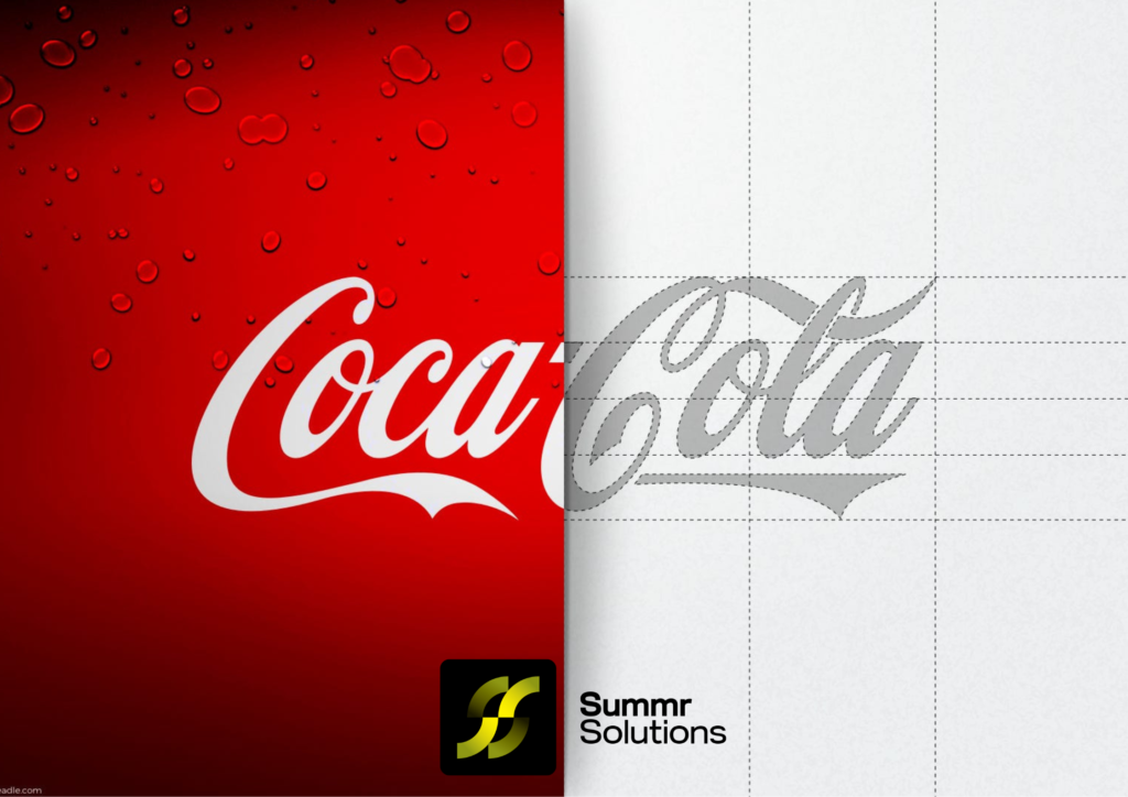
- Coca-Cola: The curvy contours of the Coca-Cola bottle are iconic and evoke feelings of nostalgia and comfort. The brand’s name, with its soft sounds, reinforces this emotional connection.
Looking to join the ranks of top brands like Google, Apple, and Coca-Cola? Summr Solutions can help! Our design services will elevate your brand with effective and creative solutions. Contact us now for more information.
Conclusion: Harnessing the Bouba-Kiki Effect for Design Success
The Bouba-Kiki effect offers valuable insights for designers looking to create impactful products and experiences. By understanding the interplay between sound and shape, designers can craft compelling visual identities, enhance user experiences, and foster emotional connections with their audiences. Whether in branding, product design, or web design, leveraging the Bouba-Kiki effect can lead to more meaningful and memorable interactions, ultimately driving brand success in an increasingly competitive marketplace.


