


In an era where over 60% of web traffic comes from mobile devices, having a mobile-friendly website is no longer optional—it’s essential. Mobile optimization ensures your site performs seamlessly on all devices, enhancing user experience, boosting SEO, and increasing conversions.
This blog explores the critical role mobile optimization plays in a website’s success and offers actionable tips to help you stay ahead in the mobile-first world.
1. Why Mobile Optimization Matters
Mobile devices have transformed how users interact with websites. Here’s why optimization is a must:
- User Experience (UX): Mobile visitors expect fast-loading pages, easy navigation, and responsive designs.
- Search Rankings: Google prioritizes mobile-friendly sites in its rankings, thanks to mobile-first indexing.
- Higher Conversions: A mobile-optimized site can lead to improved engagement and higher sales or inquiries.
Did You Know?
A one-second delay in mobile load time can reduce conversions by up to 20%.
2. Key Elements of Mobile Optimization
To ensure your website meets mobile users’ expectations, focus on the following:
- Responsive Design: A responsive site adjusts seamlessly to fit any screen size.
- Touch-Friendly Navigation: Design buttons and menus that are easy to tap without zooming.
- Optimized Images and Videos: Compress visuals to reduce load times without compromising quality.
- Readable Fonts: Use scalable fonts that are easy to read on smaller screens.
Want a website that works flawlessly on mobile? Summr Solutions specializes in creating mobile-friendly designs that captivate users.
3. Mobile Optimization and SEO
Mobile optimization directly impacts your search engine rankings. Here’s how it ties into SEO:
- Page Speed: Faster load times improve user experience and boost rankings.
- Core Web Vitals: Google evaluates mobile responsiveness, visual stability, and interactivity to rank websites.
- Mobile-Friendly Testing: Regularly use tools like Google’s Mobile-Friendly Test to ensure compliance.
Pro Tip: Optimize meta titles and descriptions for mobile SERPs by keeping them concise and compelling.
4. Mobile Optimization for E-Commerce Websites
For e-commerce sites, mobile optimization is a game-changer.
- Streamlined Checkout: Simplify forms and integrate mobile wallets like Apple Pay for quick transactions.
- Product Displays: Use carousels or swipes to showcase products efficiently.
- Click-to-Call Buttons: Make customer support accessible with touch-friendly contact options.
Example: A fashion retailer increased mobile sales by 35% after implementing a one-page checkout process optimized for smartphones.
5. Common Mistakes to Avoid
Even with good intentions, websites often fall short in mobile optimization. Avoid these pitfalls:
- Unresponsive Images: Large images can slow down load times. Use adaptive resizing or lazy loading.
- Pop-Ups on Mobile: Intrusive interstitials can frustrate users and lead to penalties from Google.
- Neglecting Testing: Ensure your site functions well across various devices and browsers.
6. Tools and Strategies for Better Mobile Optimization
Achieving mobile optimization is easier with the right tools and strategies:
- Content Delivery Networks (CDNs): Use CDNs to reduce latency and speed up content delivery.
- AMP (Accelerated Mobile Pages): Simplify content for near-instant loading on mobile.
- Analytics Tracking: Monitor mobile performance metrics to identify and resolve issues.
Recommended Tools:
- Google PageSpeed Insights
- GTmetrix
- BrowserStack for cross-device testing
Struggling to optimize your website for mobile? Let Summr Solutions help you create a mobile-first experience that drives results.
7. Future Trends in Mobile Optimization
Stay ahead by keeping an eye on these emerging trends:
- Voice Search: Design content to answer voice queries concisely.
- Progressive Web Apps (PWAs): PWAs blend the functionality of an app with the accessibility of a website.
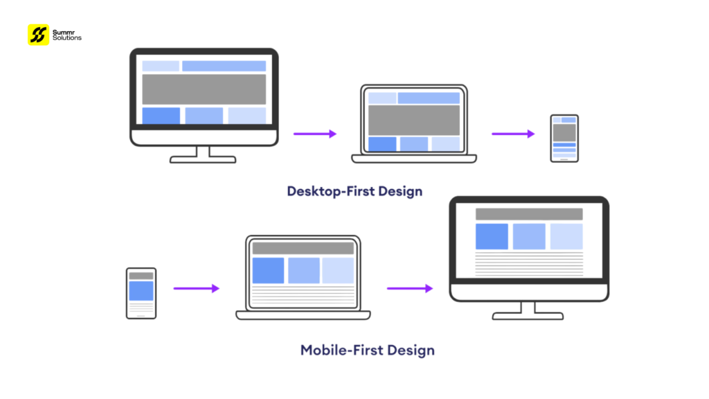
- Mobile-First Designs: Begin your design process with mobile users in mind, then scale up for desktops.
Fun Fact: By 2025, nearly 75% of internet users will exclusively use mobile devices to access the web.
Conclusion
Mobile optimization is no longer a nice-to-have; it’s a necessity for any website aiming to succeed in today’s competitive digital landscape. By ensuring your site is fast, responsive, and user-friendly, you’ll improve engagement, boost SEO, and enhance conversions.
Ready to create a website that shines on mobile? Contact Summr Solutions today and let us craft a mobile-first strategy tailored to your needs.


 English