Typography is often regarded as the art and technique of arranging type to make written language legible, readable, and visually appealing. In the realm of user interface (UI) design, typography extends beyond mere aesthetics; it plays a critical role in shaping user experience. The typeface impact on users can either enhance their connection to the brand or create a disconnect. This blog post explores the various dimensions of typography and typeface impact in UI design, highlighting their importance and impact on user engagement.
At Summr Solutions, we understand the pivotal role typography plays in UI design. Our expert team is ready to elevate your digital presence through tailored web solutions. Contact us today!
The Role of Typography in UI Design
Readability and Legibility
The primary function of typography in UI design is to ensure that text is easily readable and legible. Readability refers to how easily a reader can understand the text, while legibility pertains to how distinguishable individual letters and characters are. Designers must choose typefaces that facilitate both aspects, as poor typography can lead to user frustration and disengagement. Sans-serif fonts like Arial and Helvetica are often favored for digital interfaces because of their clean lines and clarity, making them easier to read on screens.
Establishing Hierarchy
Typography also helps establish a visual hierarchy within a design. By varying font sizes, weights, and styles, designers can guide users’ attention to the most important information. For instance, headings should be larger and bolder than body text to signify their importance. This hierarchy allows users to scan the content quickly, enhancing their overall experience. Effective use of typography can turn complex information into digestible chunks, leading to better comprehension.
Understanding the typeface impact on user experience is critical for achieving a successful design. If you want to improve your website’s user interface and engagement, reach out to Summr Solutions for expert guidance!
Brand Identity and Consistency
Typeface selection is a powerful tool for expressing brand identity. The fonts a brand chooses can convey specific values, emotions, and personality traits. For example, a tech company might opt for sleek, modern typefaces to evoke innovation, while a boutique may choose elegant serif fonts to communicate luxury. Consistency in typography across different platforms (websites, apps, social media) is crucial for maintaining brand recognition. Users should easily identify a brand through its typographic choices, reinforcing its identity in a crowded market.
Emotional Resonance
Different typefaces evoke various emotional responses. For instance, rounded typefaces often feel friendly and approachable, while sharp, angular fonts may convey a sense of sophistication or edginess. Designers must be mindful of these associations when selecting typefaces, as they can significantly impact users’ emotional engagement with a product. By choosing typography that aligns with the intended message and brand personality, designers can foster a deeper connection with users.
The Technical Aspects of Typography in UI Design
Responsive Typography
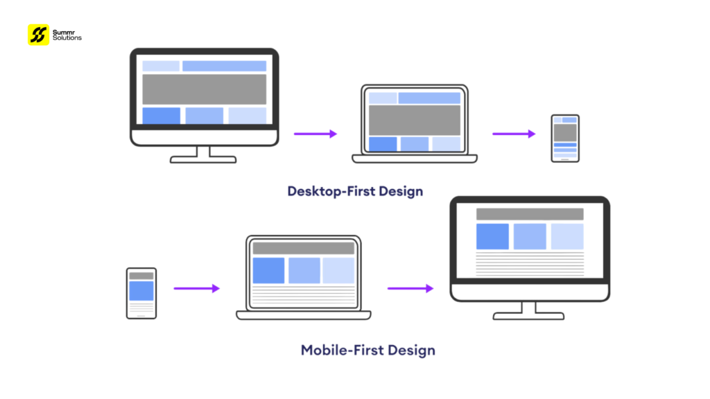
In today’s multi-device landscape, responsive typography is essential. Text must adapt seamlessly across different screen sizes and resolutions. Designers should utilize relative units like ems or percentages instead of fixed units like pixels, ensuring text remains readable on any device. CSS techniques such as fluid typography can help achieve this, allowing font sizes to scale proportionally based on the viewport.
Web Fonts and Performance
The rise of web fonts has expanded typographic possibilities for UI designers. Services like Google Fonts and Adobe Fonts provide a vast array of typefaces that can be easily integrated into web projects. However, it’s essential to consider performance; excessive use of web fonts can lead to slower load times. Designers should select a limited number of typefaces and utilize font subsets to optimize loading speed without compromising aesthetic quality.
At Summr Solutions, we offer comprehensive web design services that prioritize both aesthetics and performance. Reach out to discover how we can help you create a high-performing website!
Accessibility Considerations
Typography must also cater to users with varying abilities. Ensuring text is readable for individuals with visual impairments is paramount. Designers should consider factors such as contrast, font size, and spacing. Using high contrast between text and background colors enhances legibility, while sufficient line height and letter spacing improve readability. Additionally, providing options for users to adjust text size can enhance the accessibility of a UI design.
Best Practices for Typography in UI Design
Limit Font Choices
To maintain a cohesive look, designers should limit the number of fonts used in a single project. A general rule of thumb is to use no more than two or three typefaces: one for headings, one for body text, and possibly one for accents or special elements. This approach helps create visual harmony and prevents the design from feeling chaotic.
Establish a Typographic Scale
Creating a typographic scale helps maintain consistency in font sizes throughout the design. By defining a set of sizes for headings, subheadings, body text, and other elements, designers can ensure that text appears balanced and harmonious. This scale can be based on a modular scale or a ratio, allowing for a systematic approach to typography.
Consider Line Length and Spacing
Optimal line length is crucial for readability. A line length of 50-75 characters is generally recommended for body text, as it facilitates easy scanning. Additionally, sufficient line height (1.5 times the font size is a common guideline) helps prevent text from feeling cramped. Proper spacing between letters (tracking) and words also enhances readability, creating a more pleasant reading experience.
Test with Real Users
Finally, testing typography choices with real users can provide invaluable insights. Conducting usability tests or gathering feedback can help identify any readability or comprehension issues. Observing how users interact with the text can inform adjustments to improve the overall design.
Don’t underestimate the typeface impact on your digital presence, consider partnering with Summr Solutions. Our team can conduct usability testing and provide valuable insights for your project!
Conclusion
In conclusion, typography and typefaces are integral components of UI design that profoundly impact user experience. From enhancing readability to establishing brand identity, thoughtful typographic choices can significantly influence how users engage with a product. By understanding the role of typography in UI design and implementing best practices, designers can create visually appealing and user-friendly interfaces.
Ready to transform your UI design with effective typography? Contact Summr Solutions today to learn how our services can elevate your digital presence!


